I am taking a course in colour theory at University of Borås. When I first read that we were going to write a report about colour, I thought, “Oh, what am I supposed to write about?” But when I later saw the different topic suggestions from our teacher, I realised that there are actually many interesting subjects to explore.
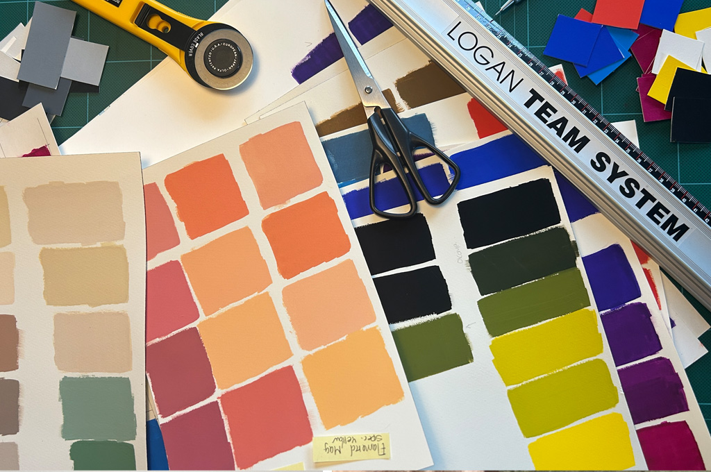
Since I am an illustrator, artist, and surface pattern designer, I felt that I wanted to write about something connected to these fields. In the end, I decided to focus on colour harmony through the use of a limited palette.
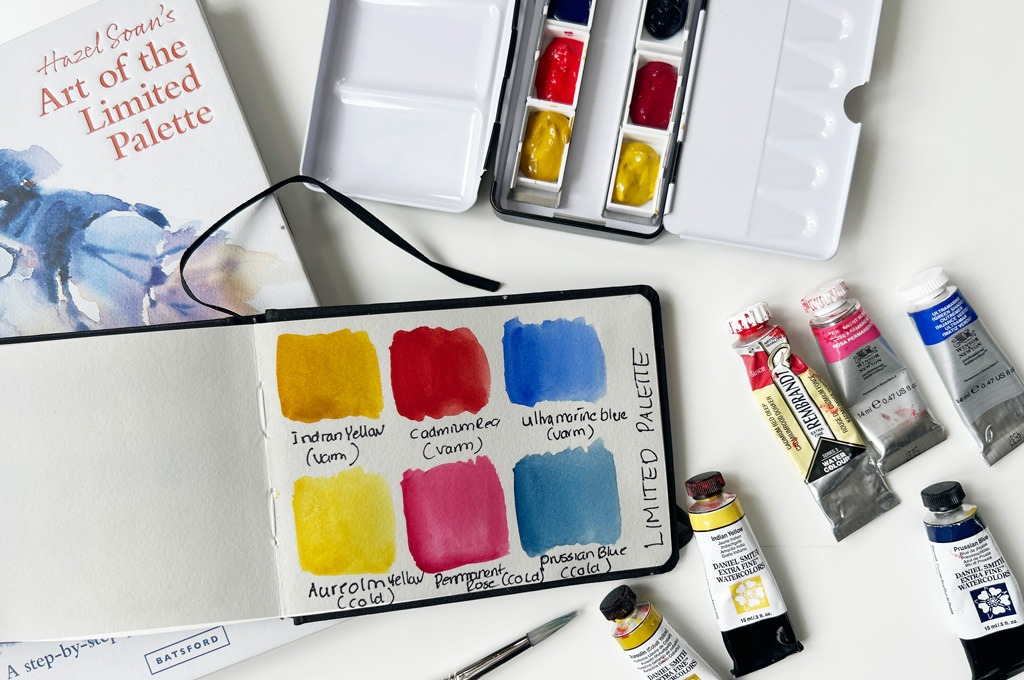
In the report, I want to explore painting with a limited palette, which means intentionally reducing the number of colours on the palette to just a few colours instead of using the entire colour spectrum. This is something I have wanted to explore and learn more about for a long time. I have already read The Art of the Limited Palette by Hazel Soan from cover to cover, and it has been incredibly inspiring.
Possible research questions I would like to work with in the report
• Which colours are best suited for a limited palette, and why?
• Why should one use a limited palette?
• How do you work with a limited palette?
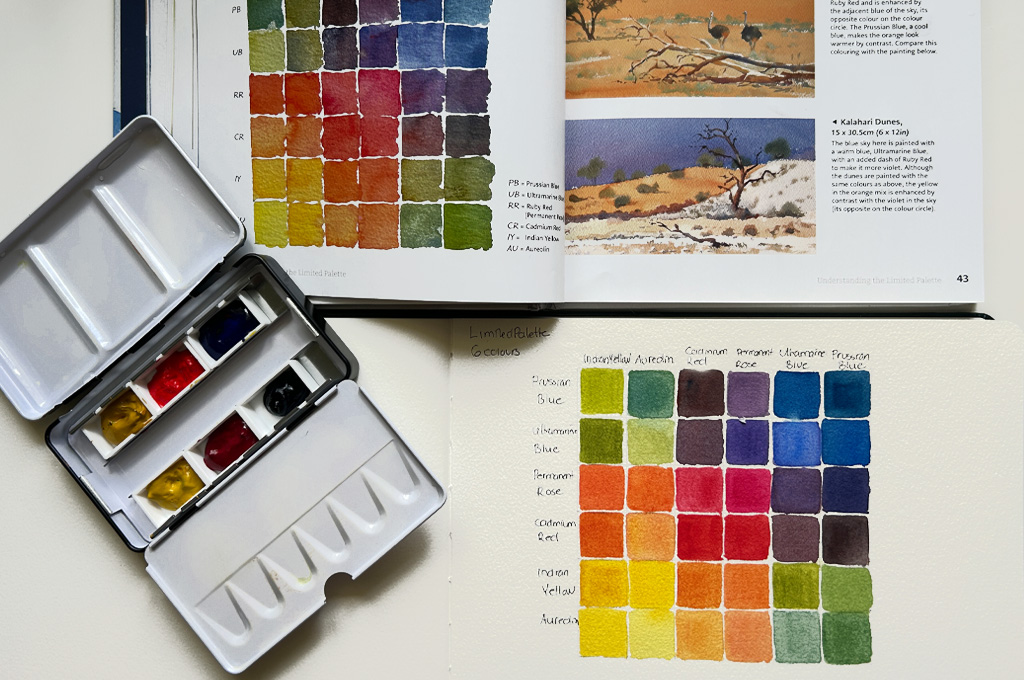
After reading The Art of the Limited Palette, I created a palette based on Hazel Soan’s recommendations: a warm yellow (Indian Yellow), a cool yellow (Aureolin), a warm red (Cadmium Red), a cool red (Ruby Red or Permanent Rose), a warm blue (Ultramarine Blue), and a cool blue (Prussian Blue).
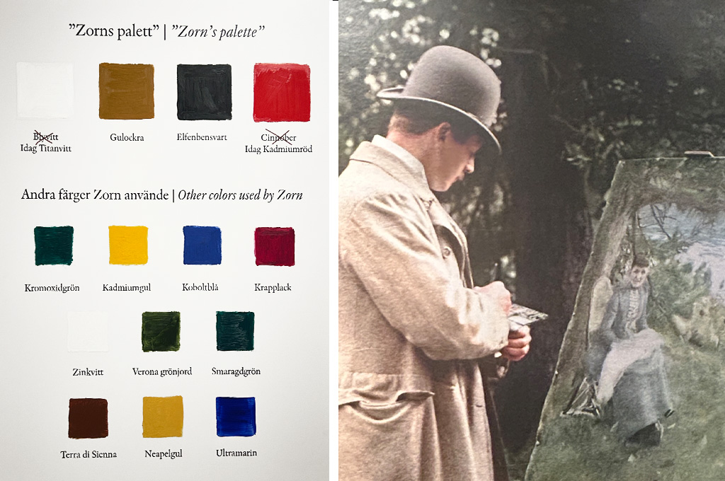
Zorn’s palette – photos from my visit to Zorn Museum, summer 2025.
“If you doubt your own ability, you will never create great things.” – Anders Zorn.
I would also like to highlight Anders Zorn, an artist who is often associated with the use of a limited colour palette. His artistic expression has long been a great source of inspiration to me.